

“Why would they have book covers if we aren’t supposed to judge the book by them? It makes no sense.”
– Ingrid Weir
You may not know Ingrid Weir, but what she says is absolutely correct. The cover is the first thing that catches your attention when you are browsing through a library or a bookstore (whether online or in a physical store). For better or (for) worse, our first impression of someone’s work is often based on what we see on the cover of a book. A good (read eye-catching, crisp, and professional) cover draws us in and persuades us to buy it by sparking our interest or inciting our curiosity. A bad cover, on the other hand, with an unexciting image, sloppy design, or hard-to-read font, can be a big turn-off for potential buyers and hence, could ruin your sales.
Book Covers Are Now More Important Than Ever
While book covers have always been important, the rise of digital technology has made them vital to the success of a book. With several self-publishing platforms, the number of eBooks being published has dramatically increased. According to an estimate, there are more than 6 million Kindle eBooks on Amazon. And the figure is continuously increasing, resulting in an ever-increasing competition.
In such a scenario, if your eBook doesn’t have a cover striking enough to grasp the attention of potential buyers while they are browsing through the digital shelf, your career as a writer is finished before even starting.
How to Design a Perfect eBook Cover? 5 Tips from Graphic Designers
Although book covers can be designed with a good Book cover designer software, eBook covers are better to be left to professionals (just like editing), if you really want to give it a try, follow these tips to make sure you check all the boxes of a perfect eBook cover:
- Identify the Patterns in Your Genre or Niche and Follow Them
While you want your eBook cover to stand out, you also want it to fit in the overall theme of the genre to generate sales. A quick research on Amazon (or any other eBook publishing platform) will tell you that there are certain themes for design, color palette, and imagery for different categories of eBooks. They help express certain feelings and help the writers appeal to particular emotions. For example, the covers of crime, mystery, and thriller novels typically have darer hues and eerie images. Here are a few examples from Amazon:

Non-fiction books, on the other hand, use simple and sleek designs and solid colors that relate to the subject of the book.
Yes, there are certain colors associated with different types of non-fiction books. For example, shades of blue, black, and grey are considered the best choices for business development books, and orange and yellow are the best color choices for books on productivity-related topics. Here are a few examples to give you a better idea:

It is important to note here that there are no strict set of rules when it comes to colors for non-fiction book covers – all colors are considered appropriate, in general.
Overall, your eBook cover should stand out from competitors but fit the genre. Otherwise, your eBook wouldn’t attract the right audience and will not sell as a result.
- Use an Image ThatHintatThe Content
Out of all the elements of an eBook cover, the image stands out the most. Hence, the primary responsibility of capturing readers’ attention lies on it. Ideally, the image on your eBook cover should be a little descriptive; it should give readers the idea of what the book is about. But, at the same time, it should also garner their interest. In an attempt to pique readers’ curiosity, many new eBook writers often make the mistake of using images that leave the audience guessing the content or, worse, are misleading. Take a look at the following examples of eBook covers and try guessing what they are about:

What do you think the book is about? Gardening or bees, right? Wrong!
This book is a novel based on a man’s journey to uncovering the truth about his wife’s mysterious murder. Want to know how it’s related to gardening? Well, the man is an amateur gardener! And NO! The bees do not have anything to do with the murder or even with the plot.
It’s important to mention here is that a descriptive image doesn’t have to be a photograph. It can be an illustration or other forms of creative art. Just make sure it conveys the right message and isn’t too complicated. When it comes to eBook covers, you’re better off with a simple image that’s easy to understand than an elaborate one that would require you to explain the concept behind it.
- Use an Image That’s Not Crowded
You may have an image that you think reflects the core concept of your eBook. But, this doesn’t necessarily mean that you can use it for the cover. An image needs to meet certain conditions to be used for the cover of an eBook. The most important of them is that it should not be too crowded. In other words, it should have enough open space for title, subtitle, and author’s name. You don’t want the text to cover the image so that its beauty is compromised.
- Use Easy-to-Read Typography
There are three things to consider in eBook cover typography – the font style, size, and quality. The font should not be easy to read, the text should be in the right proportion with the image, and the quality of typography should be good enough that text can be readable even in the thumbnail. While all this information is common knowledge, what many amateur eBook writers do not know is that font style should be selected according to the genre of the eBook.
There are many fonts that can be used for both fiction and non-fiction eBook covers. However, certain font styles are better suited for specific genres. For example, Century Gothic font is more apt for thrillers and mystery novels, whereas cursive fonts, like Aphrodite, are better suited for romantic novels. Simple fonts with a classic feel, like TarjanPro and Calibri, can be used for all types of eBook covers.
Here are some more typography tips that you should remember while designing your first eBook cover:
- Try not to use too many typefaces on the cover. Only professional cover designers can work with multiple fonts without making the book cover look cluttered. If you’re an eBook writer without any experience in graphic designing, it is better to stick to one family of fonts and do not use more than two typefaces, at max.
- Use a smaller font size for subtitle and author’s name.
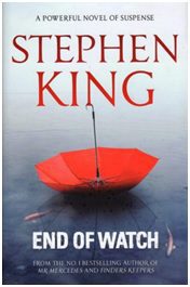
- Place the title and subtitle in the top half of the cover. The only exception for eBook covers where the author’s name can be placed before the title is when the author is a leading name in the industry. Here’s an example:
Designing an eBook Cover is Both Art and Science
These are just some of the basic tips for designing a compelling eBook cover. Several factors need to be considered to make sure the cover reflects the book’s theme as well as be visually appealing enough to grab readers’ attention from hundreds of eBooks. It’s both art and science and requires both technical skills and an artist’s eye. This is why most eBook writers hire professional graphic designers for the job. Most eBook writing services have eBook cover designers on board, so if you are working an eBook wiring service for editing or publishing, they can also help you with the eBook cover.
Author Bio
Rob Davis is a master of the trade when it comes to ghost eBook writing services. With a small team of seasoned eBook ghostwriters that can help bring ideas to life in well-written and thoroughly researched eBooks, you can expect the very best when you work with his team.