
Everyone at some point in time, attempted to sketch out their favorite pattern or doodle. Creativity should flow from within you. Everyone is an artist in some unique form but we’re never aware of it. Now coming back to business terms, a logo design is a lot like a piece of art, having different color schemes, fonts, styles and textures. The only difference is that for a good logo design, proper vector scaling is needed. Logos cannot be drawn freehand but need precision for picture-perfect quality. For most people, Adobe Illustrator is the go-to software because it is a vector drawing tool. Every image can be resized and manipulated to any agree while maintaining top-notch quality. But in this case an Adobe Photoshop software, even though it is not a vector tool and leaves images pixelated, it makes up for in popularity among thousands. Plus Photoshop is paid for, in certain aspects, giving you access to the latest features and updates. Let’s walk you through a step by step guideline on how to create a basic custom logo design using all the simple tools and font options and maybe you’ll be the next big thing in logo designing very shortly.
A Basic Guide to Creating A Logo On Photoshop
It doesn’t matter if you’re a professional or a beginner in the stages of designing. Everyone is prone to making mistakes and sometimes may lose sight of everything they’ve previously learned. Follow along through this step by step guide on the basics of creating a logo for beginners. For every creation we first need
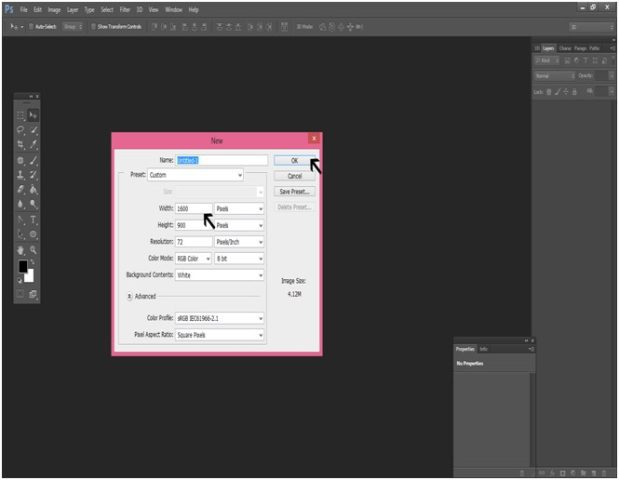
- A blank canvas
A blank canvas is the starting point to your editing road. First you open up PS cc, and click on File (Create New ). After this you fill in the project name and adjust the width and height of the page. For Eg: we set the width to 1600 px and height to 900 px keeping in check that you can select just about any size scale you want. Next step is choosing a background color. The background color is very important even if it seems vague or unimportant at first. We went with the color, sRGB JEC61966-2.1.
- Choose your text for your logo
Choosing a text style is one of the most important steps required for creating any logo design. Along with the image and color, it depicts a clear message of what your business or company is trying to portray. It may seem like a casual step to creating the perfect logo but it plays a huge role in terms of adding emotion and vibe to every logo. Go to the toolbox option on the left and there’ll be a portion for you to write your catchphrase, slogan or company name – choose your logo text and font style, then move on to the color. It should complement the background. You can also focus on more advanced options that professionally tune-up the logos text giving it an edgier or classy feel. To change the position of the text you can do this by tapping the letter V, re-positioning the object.
- Adding your graphics
If you’re feeling artsy and want to go for something much more than just texts, how about try out a picture or adding graphics that make your logo pop or maybe more appealing. Sometimes adding graphics can be a little tricky or a better word, tacky if not done correctly. It all depends on what your business is trying to sell and how you want every customer to see you. For a logo object, you can use just about any image for instance a teacup or a picture of a bee. It’s better to edit out the background of the object in the image. For selecting one press + O to open it up. Keystroke W and apply it to the entire object you’re using. Then right-click and select , it’ll open up a layer named , then move and add it to .
These are the three key principles to creating a beginners level logo. It’s much easier than you think. If you must take it a step further, how about trying out some other effects.
Additional Effects for Your Text
There is no particular rule for creating your textual font. It doesn’t always have to be basic. Not all logos require an extra touch but a few texts that require a three-dimensional touch. The best kind is Bevel and Emboss, which highlights every edge of each letter on the front giving it a 3D appearance. If you want it to stand out then add Contour.
Another visually satisfying effect is called Outer Glow. It can be used only for certain fonts which makes it unique. That doesn’t mean you go crazy adding to every text you choose, so use it wisely.
There exists a Blending Options tab which allows you to outline each letter in your text if that’s the kind of effect you are going for; with additional options of altering thickness and color of every stroke available on the right. There are plenty of options available in the Blend Options portion allowing you to fine-tune everything. When you are finally done editing and are satisfied with the way it looks, you save the image in whatever format you like but preferably a PSD one for future editing.
In Conclusion using photoshop for creating a timeless logo takes a lot of time and a lot of effort. It may seem difficult at first but as the saying goes “Try and try again”. There is no such thing as making a mistake. It is through these little trials that you get familiar with every tool and software you use to create these timeless pieces, be it for logo designing or anything else.
What’s the harm in trying right? It is just a beginners tutorial. Who knows over-time you might be hired to make logos for others once you get to your level of a pro.
About Author:-
Lauren Lara is a professional blogger. She is passionate for writing informative articles about Web Design, Graphic Design, Custom Logo Design, Web Development, Search Engine Optimization, Digital Marketing. She is working as a Marketing Manager in Logo Infinix since 2016.