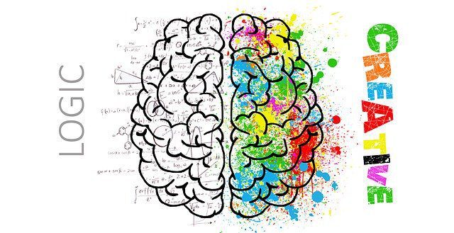
Most people have a favorite color, hue, or tint; however, far fewer are aware of the way different colors can inspire distinctive emotions.
Color psychology is the study of the way colors affect our feelings. For years, psychologists have been aware how color can have a significant influence over our emotions, but only relatively recently have they been able to back up their hunches with scientific evidence.
The primary colors in psychology
Artists have long understood the importance of color in their work. Indeed, the great Pablo Picasso once commented, “Colors, like features, follow the changes of the emotions.”
Recent research has found the colors you choose in your design work can have a massive influence over the message you’re trying to send. It can also dramatically influence the mood of the viewer. For example, red is known to raise the pulse rate, whereas blues and greens tend to have a more calming and restful effect.
Most designers are already familiar with the two main color models — RGB for screens (red, green, blue) and CMYK for print (cyan, magenta, yellow and black) — in psychology, most experts consider the primary colors to be red, blue and yellow. Mixing these colors allows you to make other colors, normally referred to as the secondary ones, which are purple, green and orange. If you imagine a color wheel, secondary colors sit between red, blue and yellow.
To make things a little more confusing, these secondary colors can also be split into a further grouping called tertiary colors. The tertiary set sits further into these gradients and typically contains two color names — e.g. purple-red or yellow-green. As their name suggests, tertiary colors are created by mixing two primary colors to different degrees.
Pure colors
Pure colors, i.e. primary, secondary or tertiary colors without the addition of black, white or any other supplemental color, are known as pure colors. They are typically intense and bright and tend to evoke feelings of happiness.
Tints, shades and tones
We can further change colors by adding white (to create tints) or black (to create shades). Tints range from a base color to almost white whereas shades vary from a pure color to almost black. Color tones are created by adding both black and white to a base color.
Understanding contrast
Designers frequently use contrast in their work to bring attention to particular text or objects. Contrast is described as the difference between two colors and how well they stand out when placed next to each other. Design companies like the ALT Agency use high contrast colors in their logo and website to bring prominence to their text-based indent as well as highlighting specific content on their site pages.
To check whether two colors have high contrast, try turning on the grayscale mode in your design package. High contrast colors will clearly stand out from each other, whereas low contrast colors will merge into one another. Contrast is frequently used in text to improve legibility and make content easier to read, e.g. black text on a white background.
Using opposite colors for impact
Often designers will choose opposite colors on the color wheel to create impact. Just as the saying in life goes, “opposites attract,” so too, do conflicting colors work well together. Opposing colors are frequently used in logo design; think blues with oranges or red with greens. When using opposing colors, you should avoid using them on a 50/50 basis but rather go for something nearing 70/30. Opposing colors have the greatest effect when there is a slight imbalance favoring one over another.
The science of chromotherapy: how color is used in psychology
Many psychologists disagree on the long-term effects of color, but its short-term impact is indisputable. As a general rule, the following colors have been observed to have these effects on patients:
- Red typically excites the mind and has been proven to raise the heart rate
- Orange leads to an increase in energy
- Yellow is considered purifying and also stimulates the brain
- Blue is soothing and can be used to alleviate pain
- Indigo is commonly used in the treatment of skin complaints
Color association as applied to design
Color can significantly change our mood or emotions towards a company or product. Consequently, you should carefully consider the colors you use in your designs. As a rough guide, evidence suggests the following:
- Gray: As gray is a rather non-descript color, it tends to merge into its surroundings. Considerable evidence exists to suggest that people who buy a gray car seek a level of anonymity and prefer not to bring attention to themselves.
- Red: Red is the color of action, power and confidence. Choosing red will always make an impact.
- White: White tends to suggest innocence, cleanliness, freshness and youth.
- Blue: Blue evokes feelings of safety, dependability and stability.
- Silver: Many high-tech manufacturers and car producers opt to design in silver as it is considered the color of modernity and innovation.
- Black: Black can have negative or positive connotations, depending on how it’s used. The color most often speaks of mystery and power; however, in some circumstances, it can also invoke a sense of foreboding.
Also Read:- 10 of the Most Common App Design Mistakes
